Year-to-Date Performance of the SEC's No-Short List
By Dr. Duru written for One-Twenty
September 21, 2008
Share Click here to suggest a topic using Skribit. Search past articles here.
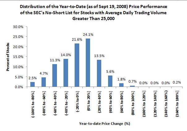
Now that the U.S. government has accelerated its activism on behalf of propping up stock prices, I thought I would take a look at the year-to-date (YTD) performance of the stocks on the SEC's no-short list. I took a look at the list as of September 19, 2008. Certainly, this list could expand given the bold move of Australian authorities to ban ALL short sales in their stock market. I removed any stock that had less than 25,000 shares of daily trading volume over the YTD period. I also removed three stocks that were not trading last year. These steps dropped the SEC's no-short list from 799 to 444 stocks. Of these 444 stocks, an amazing 46% have positive gains for the year now. I would say that such performance is pretty good, especially considering the S&P 500 is down 15% year-to-date. Given the poor prospects for the American economy going forward, I am guessing that there are a whole lot of shorts who are itching to get back into the game. See the chart below:

(Click here for my initial opinion on the banning of short-selling on financial stocks)
Here is a guide for reading this chart:
- x-axis: This is the range of year-to-date price performance. For you math majors, the "(" means exclusive of the range, the "]" means inclusive of the range. For example, (0% to 20%] represents a price range from 0 to 20% excluding 0%.
- y-axis: This represents the percentage of the 444 stocks that each bar in the graph represents. Each bar is labelled with the value from the y-axis. For example, 24.1% of the 444 stocks from the SEC's no-short list have YTD performance of within the range of (0% to 20%].
- The bar: The height of each bar in the graph represents what percentage of stocks fall within the range of price performance shown underneath the bar.
Finally, I also scanned through the 160 stocks of financial institutions that I track from time-to-time. I came up with an amazing number of stocks that are at least back to January, 2008 prices. If you insist on buying financial stocks here - I am not touching them for anything more than a quick trade until after the ban on shorting is lifted - perhaps you want to start from the list of the strongest. Here are the ticker symbols of the ones I came up listed in order of their one-day price performance on Friday: rf, mi, pjc, wbs, snbc, hban, wl, amtd, pnsn, etfc, sov, zion, jpm, wtfc, hnbc, cma, boh, cobz, tcb, acf, sivb, cpf, fhn, ucbi, stsa, pacw, wtny, wibc, laz, asbc, gbnk, ma, sti, bokf, nyb, cbc, cvbf, ffkt, bxs, onb, schw, wrld, trmk, ubsi, bbt, pcbc, cof, mtb, usb, snv, npbc, cffn, hbc, fult, pru, ffnw, cbsh, mbfi, nara, fmbi, news, wsbc, hbhc, gbci, caty, stl, vly, umpq, fnb, ozrk, fmer, cyn, hcbk, ffbc, ibcp, wfsl, buse, susq, ghl, town.
Be careful out there!
Full disclosure: Long S&P 500 in an index mutual fund (hedged). For other disclaimers click here.
Share